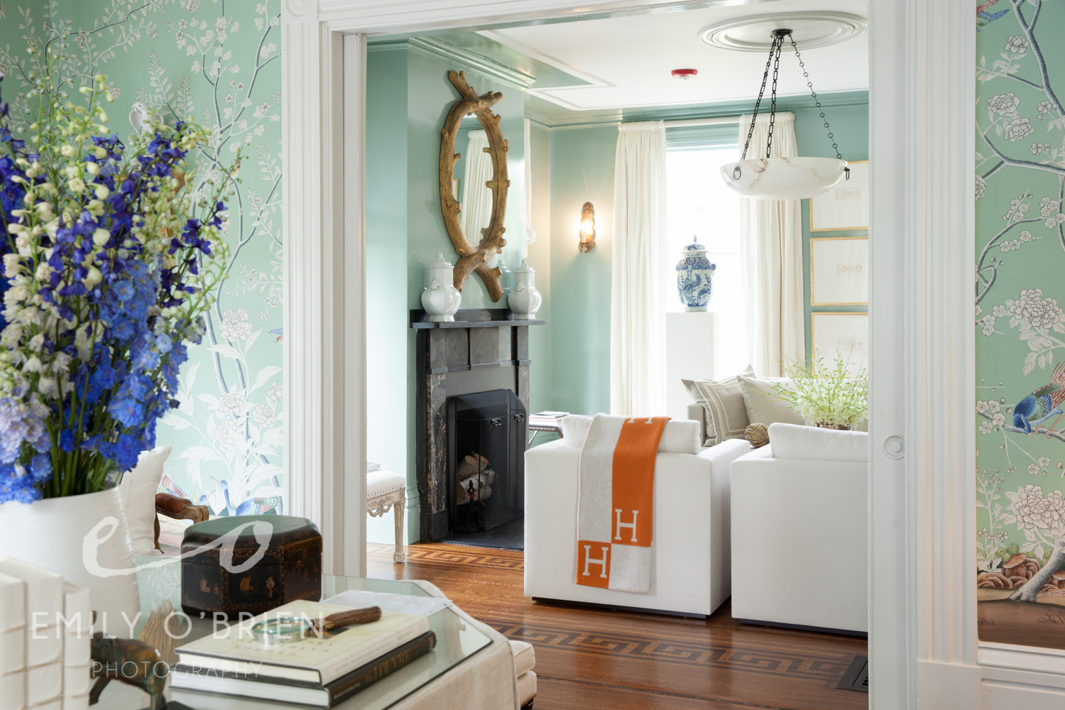
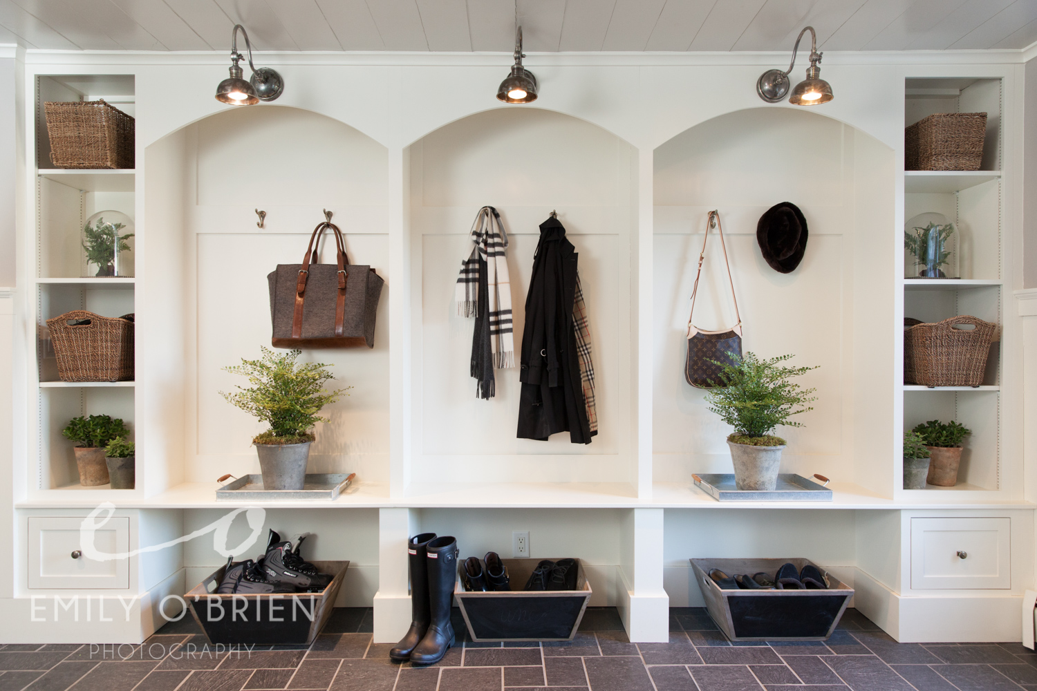
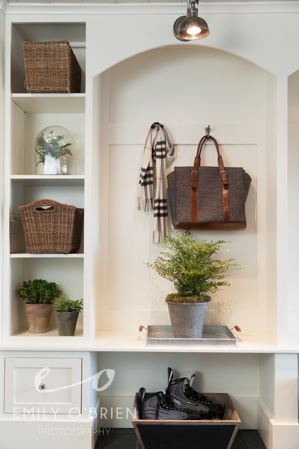
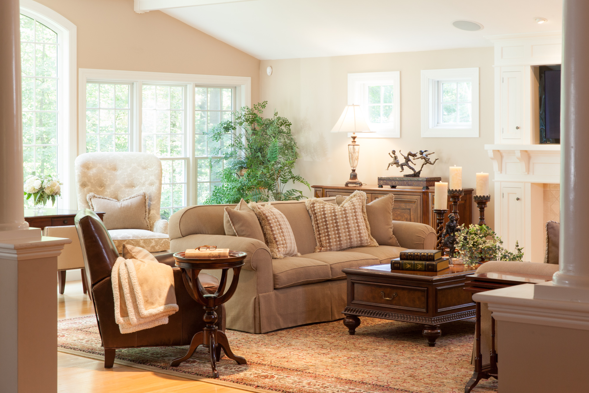
My Best of 2024 Brand Photos: The Art of Storytelling | Boston Brand Photographer
What I love about brand photography is the power of the collection of images. Brand sessions are about telling the story of the brand, and all of those images together are what make a branding session successful. But often there are one or two hero images that stand out. An image that tells a powerful story by itself, or that sums up a brand in one image.
2024 was a really great year where I got to work with so many different brands, and while a few of them were bigger or corporate brands, most of them were Boston and Massachusetts local small businesses! Working with creators, makers, independent artists, and service providers, is really where our creative process shone in 2024. Here are our top 10 branding images in 2024:


Utilizing the Location You Have for An Amazing Photoshoot | Boston Brand Photographer
I want to get real about a game-changing aspect of brand photography – the art of making your chosen location fit you and your photo shoot. I’ve spent years photographing personal brand projects not just in Boston but throughout New England, and I know it can be hard to decide on a location that does everything you want it to and more. So, where do you start?

Location is extremely important as we plan our branding shoot, but I’m here to tell you it doesn’t need to be as fancy or overtop as you may believe. Whether you're vibing in your cozy living room or soaking in the cityscape outside, it is possible to make one space the center of your visual storytelling. Trust me, it's all about getting creative in order to create a photoshoot that's as versatile as your brand lifestyle.
My first suggestion to people is always to consider where you’re comfortable working, whether that be your workspace, your office, or even your home. Not every space will be a winner, but often my clients completely overlook the potential of a versatile spot just because they are there every day. Making that space come to life is exactly what’s going to make your brand photos stand out. Don’t feel discouraged because you’re shooting in the spots of your everyday life, get excited! Being familiar in a space not only reflects on you in the photos but also reflects where the guiding force behind your brand comes from.


Bringing the versatility out of the spot we choose is all about maximizing the space. This is done by switching up the looks, poses, and angles, Simple changes in perspective can turn a familiar spot into a whole new visual experience. Remember, it's not just about the location; it's about how you frame your story within it.
If you still don’t believe in the dynamics of your spot, I’ve covered tips on making your workspace look and feel more photogenic, prepping your space with a few small details can make all the difference in the look and feel. My goal is to debunk the myth that you need a glamorous setting for a killer photoshoot. Your living room, your favorite cafe, or that cozy corner in your workspace – they're all potential gems for your photographer. Embrace the simplicity and let your brand personality take center stage.

How Working with an experienced Brand Strategist Can Elevate Your Photo Session (Part 2) | Boston Photographer

If you started on Part 1 of this post, let me pick up where I left off… Enter my dream client, interior design entrepreneur extraordinaire, Ms Rachel Reider of Reider and Co. She is doing a complete rebrand with Kris, and they need next level content to show off what this team is all about. Oh, have I mentioned her amazing, powerhouse (all female) team of 6?

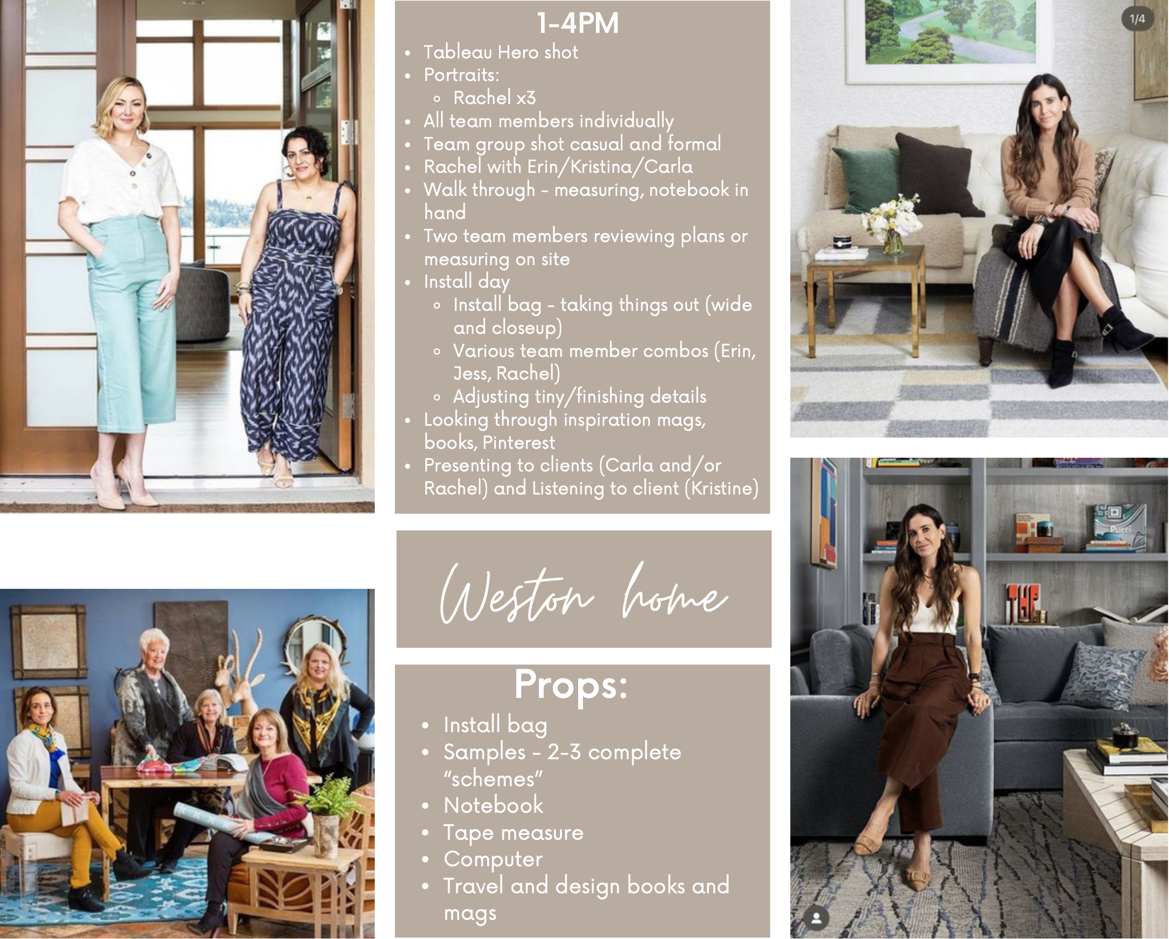
Example of a client shot list
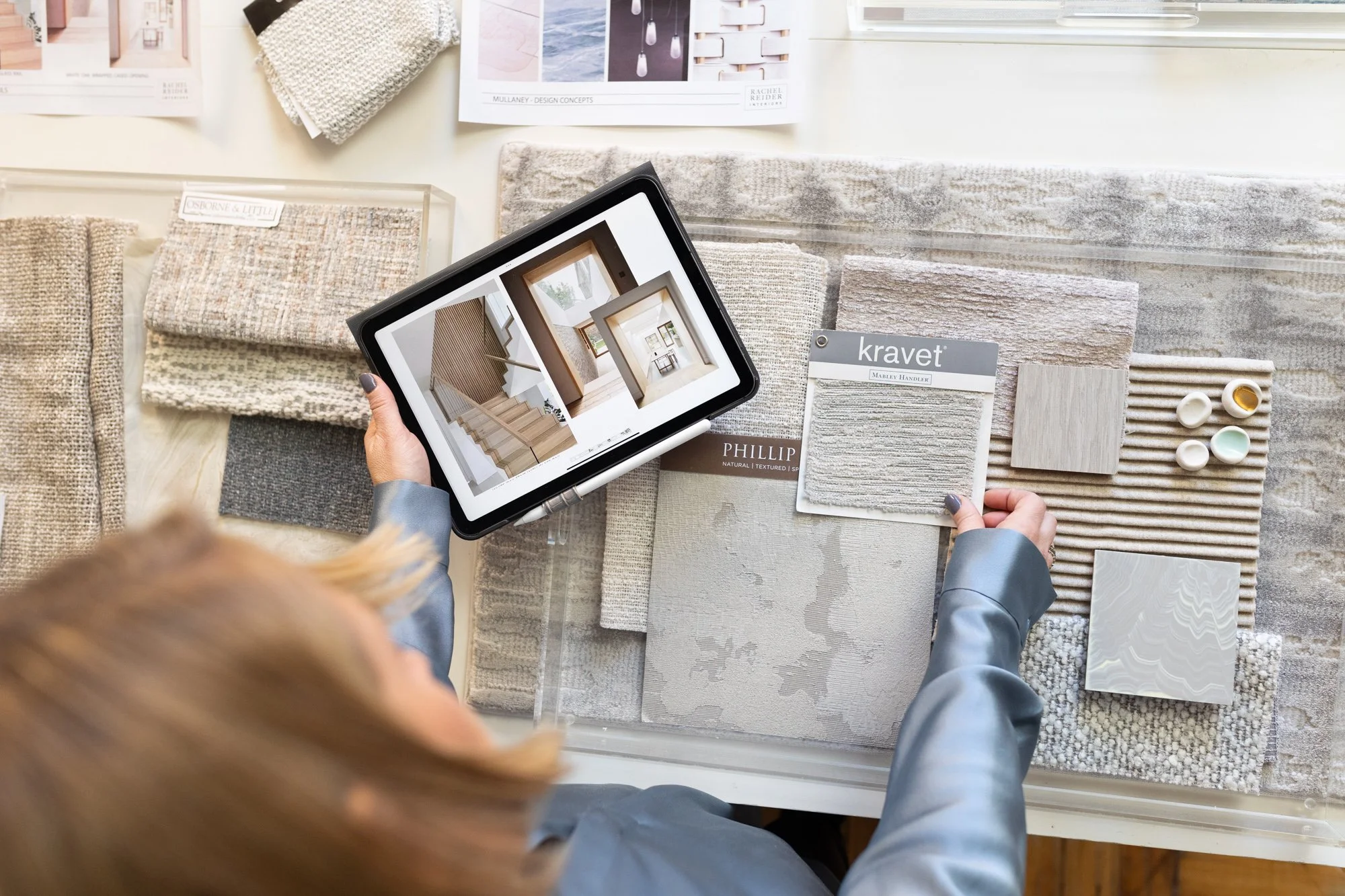
Again, I can’t stress enough how beneficial it was to have Kris on the brand strategy/art direction side of this. After diving deep into the Reider and Co brand and the direction they were going, Kris and I came up with a shot list together. Here is an example of a shot list I would create for every brand photoshoot. It includes inspiration photos, locations, and specific shots we know are a priority.

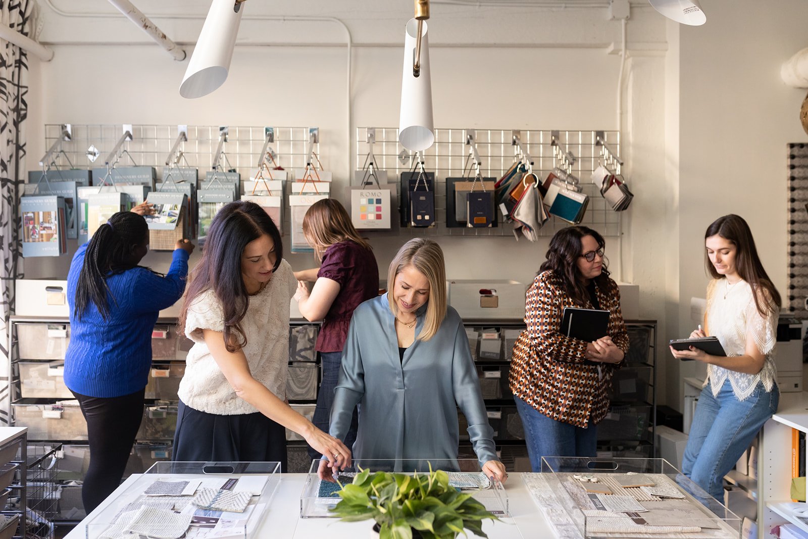
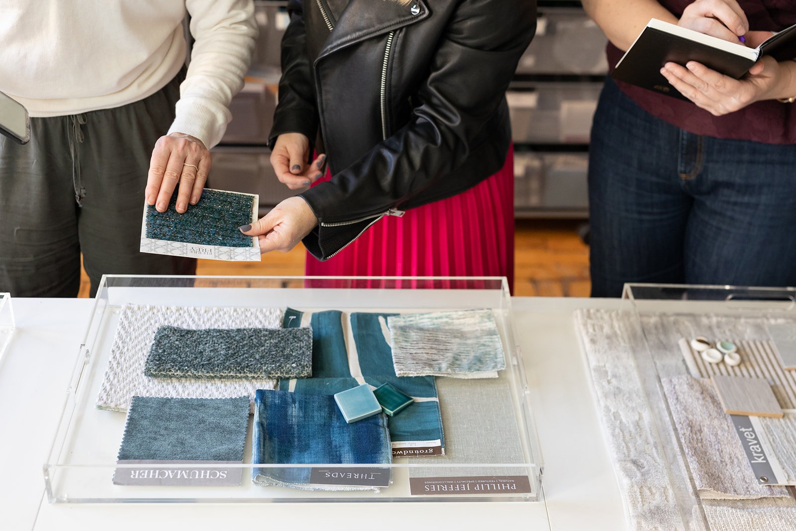
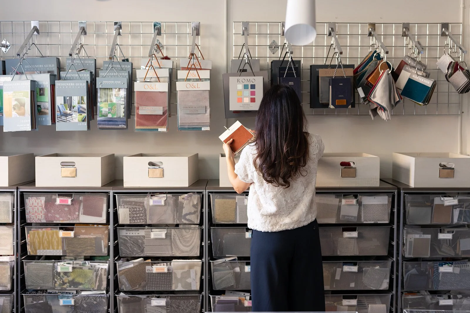
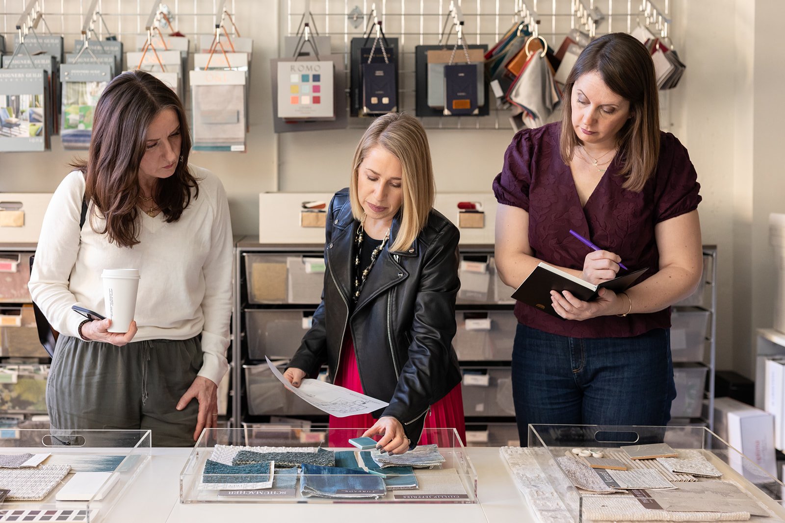
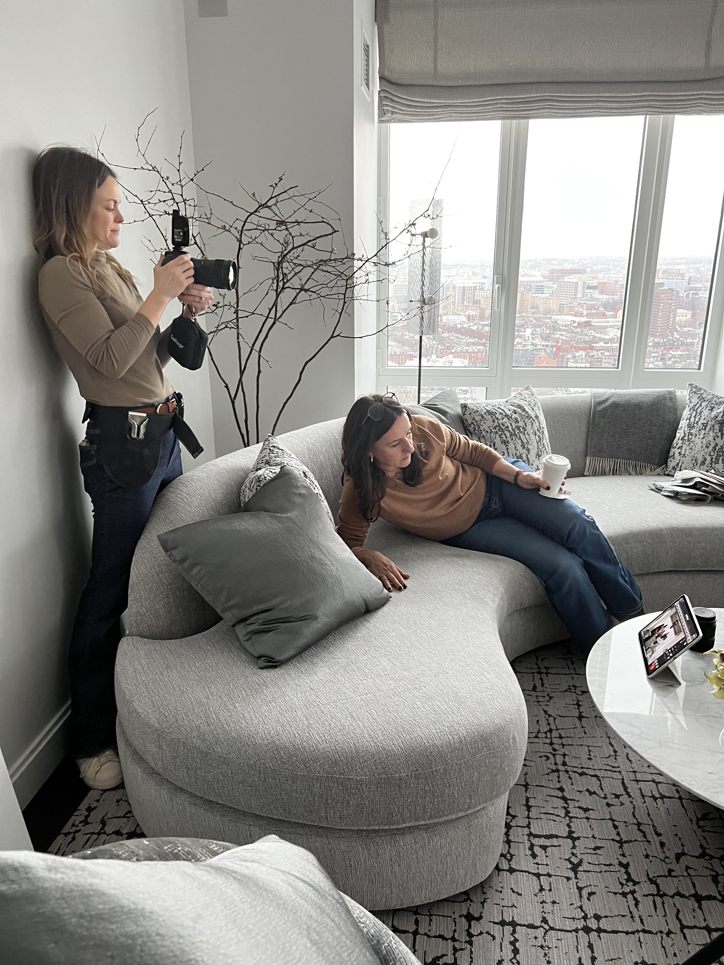
For this particular shoot, we wanted a heavy focus on the team dynamic. Day 1 included two versatile locations - one in a Back Bay, Boston condo, and the other in a suburban Wellesley home. Our main focus was really powerful team photos, headshots, as well as a peek into all of the many things that happen behind the scenes as they are working with their clients. This was one of my favorites, shot “tableau style” to highlight the all inclusive experience the team provides from start to finish.


Day 2 was on location at Rachel’s studio in the South End of Boston (two blocks away from my condo, perfect!) Our main focus was to show the day-to-day, behind-the-scenes team in action: the start of the process, the sample selection, the team meetings. All of the things we don’t think about when we see the finished product.
All in all, it was a successful brand shoot, and I am THRILLED to see these images on Rachel’s gorgeous new website. Kris did an amazing job. This is what happens when women are in charge.
Check out the Reider and Co brand new website here
Check out the very talented Kris Kennedy of Loudhouse Branding website here
Of course what would a great photoshoot be without gorgeous hair and makeup, by Paula Roderick-Voisembert

Working with a Great Brand Strategist and Why You Need One (Part 1) | Boston Brand Photographer

If you come to me and you’re already working with a brand strategist, I immediately love you as a client. Why? You’ve already taken a major step to uplevel your business. You are most likely an entrepreneur with defined goals and a clear brand story. Planning your photo shoot is already less stressful for you.
If you ARE the brand strategist, now I am doing a happy dance. When Kris contacted me because she wanted to book a photoshoot for one of her clients, the first thing we did was to schedule a call to make sure we “vibed”. I don’t know about anyone else, but entering into a relationship with someone you are not compatible with, is DANGEROUS ground. Luckily, within 5 mins we were giggling and chatting about patriarchy and lifting up women business owners in the home design industry (perfect, I love her already).
Two weeks later she came to me with her first client she wanted to book a photoshoot for… which happened to be my dream interior design client, boutique hotel design goddess, the legend herself, Ms. Rachel Reider or Reider and Co. IYKYK.
(Rachel’s team shoot blog coming on part 2 tomorrow!).

Kris had been working (heavily) with Rachel on her rebrand already, so it was easy for Kris to take the reins on direction and planning for the shoot. This was a HUGE benefit to Rachel and her team - it totally took the weight off of her shoulders, goodbye stress and overwhelm!
Kris and I chose three incredible locations (always helpful when your client has designed two luxury homes that we can use as a backdrop, and has a chic design studio in Boston’s South End), and came up with a shot list that included specific needs for Rachel’s website and social media.

On the first day of the (two day) shoot, Kris took the role as art director, and we worked as a team to produce and execute the shot list. It was a long two days for everyone, but having Kris as the art director, truly made this shoot as successful as it was.
Check out her (also newly-rebranded-coming-soon) site where you can see more details about how awesome she is.
In the meantime, her new Instagram is getting very interesting! @loudhousebranding
And you are going to be absolutely BLOWN AWAY by the new Reider and Co site. You want to know how to effectively use your brand photos? This is it… We’ll be posting Reider and Co’s final images and link to their brand new website next week! I know it’s so hard to wait!

You can find Kris on her newly rebranded Instagram @loudhousebranding and her website coming soon: Loudhouse Branding
Boston Portrait Photographer | Merrimack Valley Magazine

Merrimack Valley Magazine shoots are always a great creative outlet. Lysa Pelletier is an incredible stylist and we’ve never been disappointed by her vision. Having her and Stephen on set is the perfect balance of collaboration, and while we are always shooting for a specific layout, we get just enough creative freedom to play around a bit too.


We shot at Sage Market and Design, located in downtown Newburyport, and their showroom is stunning. With big windows opening up the room to the bay, the exquisite pieces are showcased with beautiful natural light overlooking the water. Focusing on the idea of including greens in your home during the winter months, we naturally gravitated to the wall of greenery.
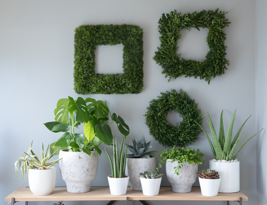
Sage’s unique pieces popped against the lush backdrop. Moving on with our theme, we continued using natural elements in the dining room table shot. We love how Lysa styled the smooth tableware, the natural edges, and the plush fur for the tablecloth.

We always have a lot of fun on these shoots, and that is because of our team. Everyone pitches in, everyone has a voice, and no one takes it too seriously... unless they are making sure I don't fall when I am dangling from a ladder. These are some of the images that didn't make the cut, but make sure to pick up the January issue to see our favorites that did make it in the issue.

Lysa Pelletier is represented Anchor Artists
Boston Interior Photographer | The Best Tablescapes You've Never Seen Before
What a busy fall for the Boston design community! Just a week after the Boston Show House opened, was the first ever Heading Home to Dinner, to raise money for a great cause, Heading Home. Of course, good friend and 3 Olives and a Twist writer, Beth Daigle and I were there for the opening night cocktail party to support friends and clients. Head over to her blog to see and read more.
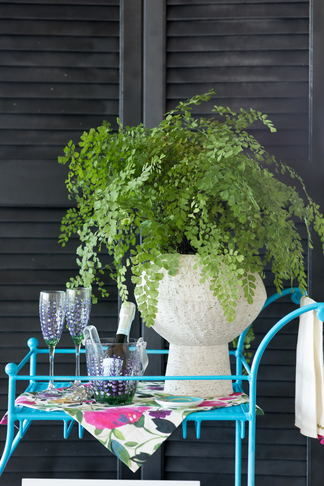
Whether you weren't able to make it, or just need a little Thanksgiving tablescape inspiration, I was in awe of the creativity behind these bar carts and tables. I'll let the photos speak for themselves.

Table by Duffy Design Group


Bar cart by Linda Holt Interiors
Bar cart by Kim Macumber Interiors

Table by Renee Rucci Design
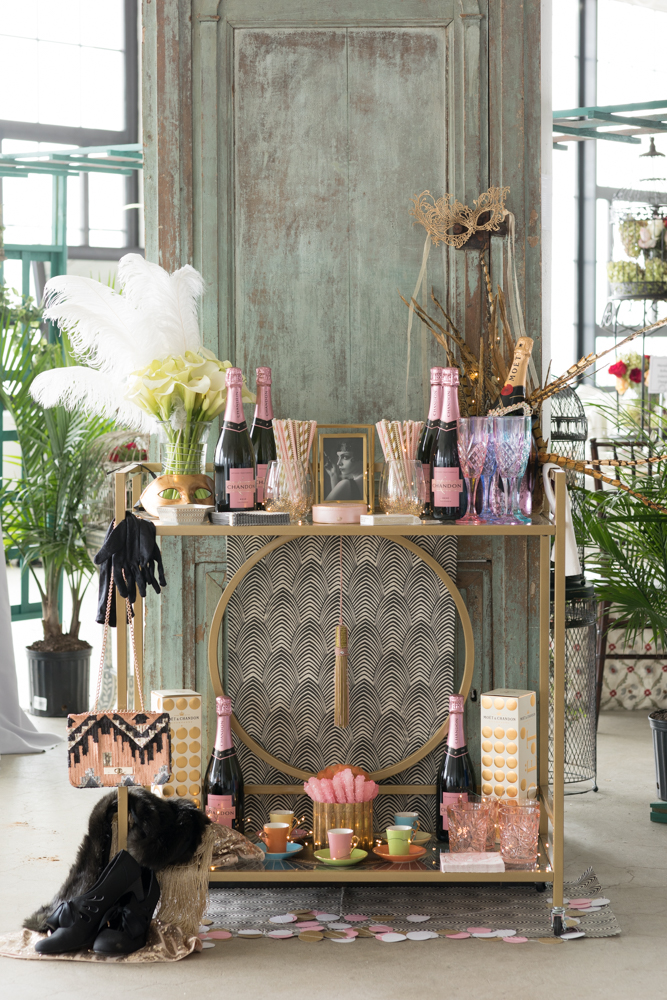

Table by Debbe Daley Designs

Table by Pamela Copeman
Boston Interior Photographer | Boston Designer Show House 2017
The first thing I noticed when I walked into this year's Designer Show House was the COLOR! Not in your face, over the top color; beautiful, strategically placed, just-the-right-amount of color. What I love about this is how relatable it is. A well designed space has to be functional, but the icing on the cake that really ups the WOW factor is the aesthetics. We first walked into this impressive pink foyer designed by Cutting Edge Homes. It was the perfect way to kick off the home.

My friend Beth Daigle, of 3 Olives and a Twist, and I went to "press day" together, excited to get the first look. Before the ribbon cutting, I had the opportunity to photograph my friend and client, Kim Macumber's room. I was so excited for her and boy did she go for it - her green butler's pantry made this small space POP. My favorite part was the moss-padded petal sink by Thompson Traders.

Talk about green - THIS LIVING WALL. Can I have this in my home now please? Tess and Ted Interiors and Anavera Design worked together to make this room cozy, unique, and a one of a kind conversation piece. I don't think I'm alone when I say this room made me want to snuggle up with a blanket, book, and cup of coffee.

Yes to cool blues and purples in the gorgeous kitchen by Kelly Rogers
Mally Skok's colorful table setting in the dining room perfectly complimented the darker paint and hand-screened window treatments.

Nostalgia hit home hard for me when I walked into this bathroom by Linda Lyons with wall to wall Dutch tile. I lived in Holland for 6 months and this was a great nod to traditional Delftware.

Go see more photos over at Beth's blog! 3 Olives and a Twist
The Designer Show House is a must see and put on by the Junior League of Boston. Visit from now until November 5.
For more information, visit https://www.jlboston.org/2017-designer-show-house/

Boston Architectural Photographer | Decorators' Show House Part 3
We are in the final days of the Junior League of Boston Decorators' Show House! We have covered a lot - The Receiving Room, The Grand Dining Room, The Morning Room covered by Beth Daigle, and the talk of the show, the magnificent Kitchen, covered by Kim Macumber.
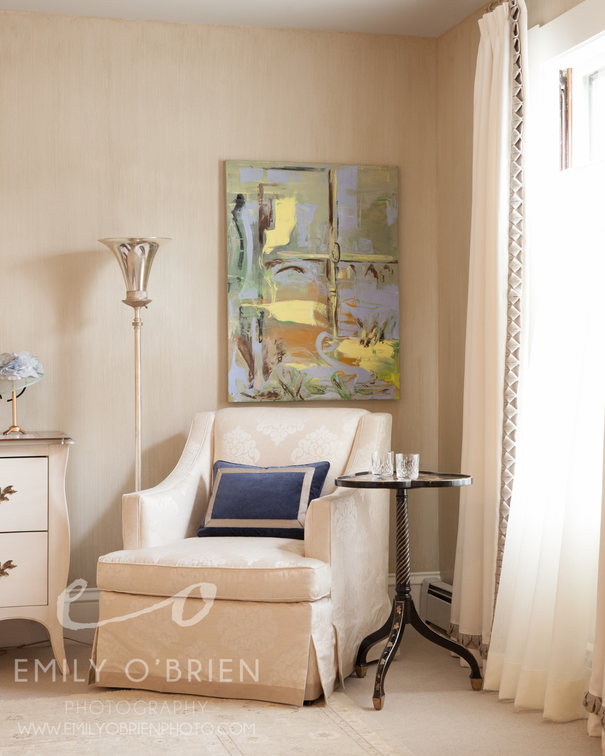
I wanted to wrap up with a few of my favorite rooms from the upstairs. The Study, by Holly Joe Interiors, is exactly the home office I would love to sit in everyday. It is gender neutral, throwing in bits of masculinity with the leather chair and darker details, but brilliantly incorporates femininity with the plants and lighter elements like the glass table and floral window treatment. I LOVE the colors, I have always been draw to the cooler, calming color palette. The textured wall paper seems to be a theme, but I am really thrilled by how it works in this room, it makes me want to dress nicely to work here... maybe a farewell to the work-from-home-in-yoga-pants days?


My favorite bedroom is the "Lion, The Witch and The Wardrobe" by Sarah Scales. Do I love it so much for the name alone? Maybe, but when I was a little girl, I always dreamed of having one of those regal canopies that I saw in movies. I love that this one has such a fantastical feel, yet keeping it dark for obvious functional purposes. Then you look up into a starry night sky above, which is intricate beadwork all along the roof of the canopy. Gorgeous.

Lastly, The Master Bedroom, by Dibby Flint Design, is just beautifully classic and romantic. Simple and so, so elegant. This sitting area really drew all of my focus, and took over my imagination. I also loved to play dress up as a child, almost on a daily basis, and I can imagine myself playing dress up with vintage gowns and afternoon tea in this very spot.
Only 2 days left to check out the Decorators' Show House!
Check out more rooms from the Show House by Myself, interior designer, Kim Macumber and writer/editor, Beth Daigle

Boston Interior Photography | Junior League of Boston Decorators' Show House
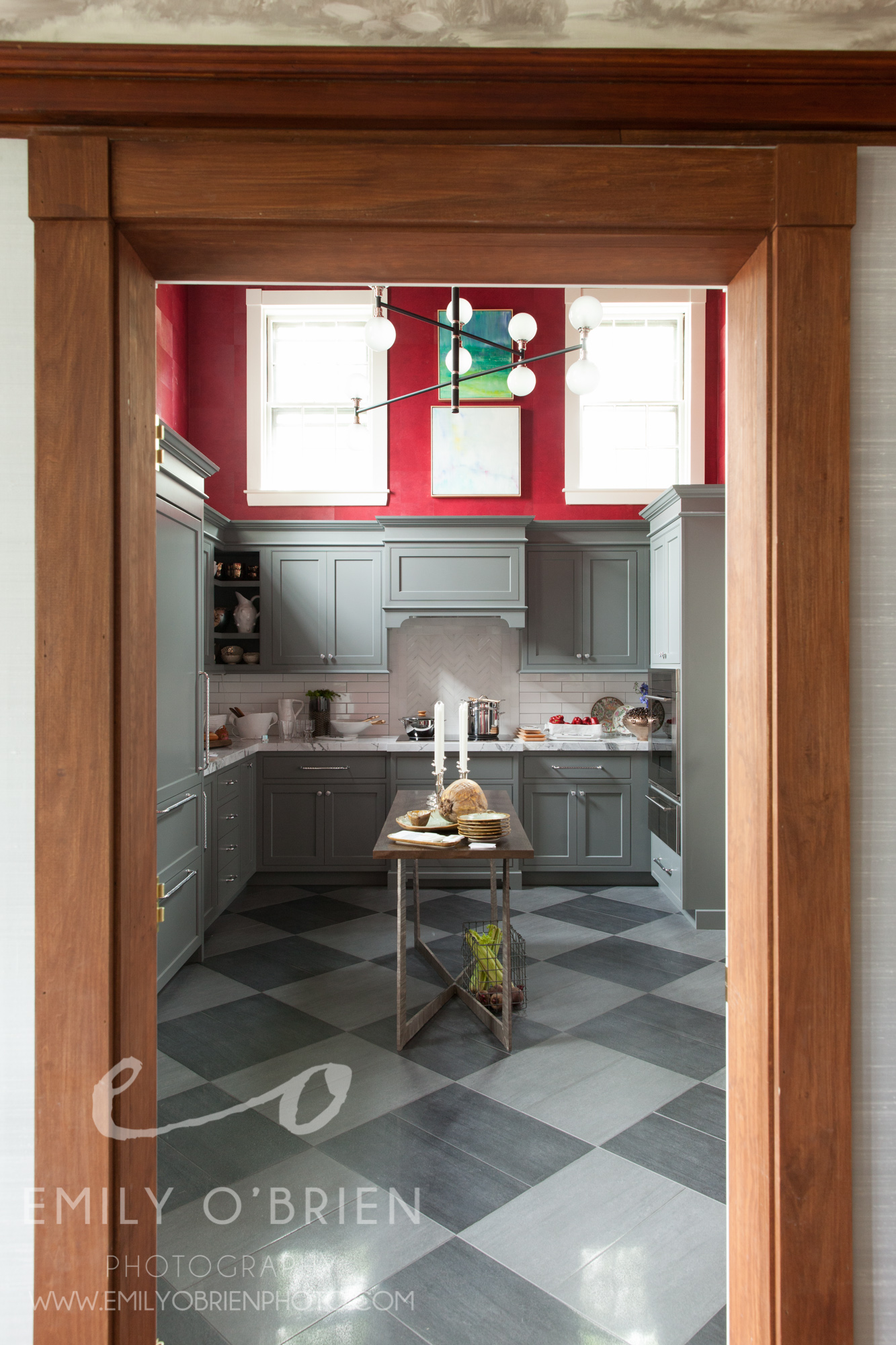
If you haven’t been following along our tour through The Junior League of Boston’s Decorator Show House, you’ll want to start from the beginning! Click here to see our first post about Gerald Pomeroy’s stunning receiving room, then click here for writer and magazine editor, Beth Daigle’s take on the beautiful sunny Morning Room, designed by Theodore and Company. Finally, prepare to be wowed by Vani Sayeed’s red kitchen, covered by interior designer Kim Macumber.
Onward! Today I’d like to draw focus to The Grand Dining Room that lies in the path between the kitchen and the morning room. There are a lot of things to love about this room, (the horse art piece for one), but my favorite is the walls! The woven silk sky-blue wall treatment adds texture, light, and contrast to the existing mahogany. Yet again, we are seeing hints of gold detail come out in this room, and I am loving the Chinese accents, like the porcelain vase shown below.

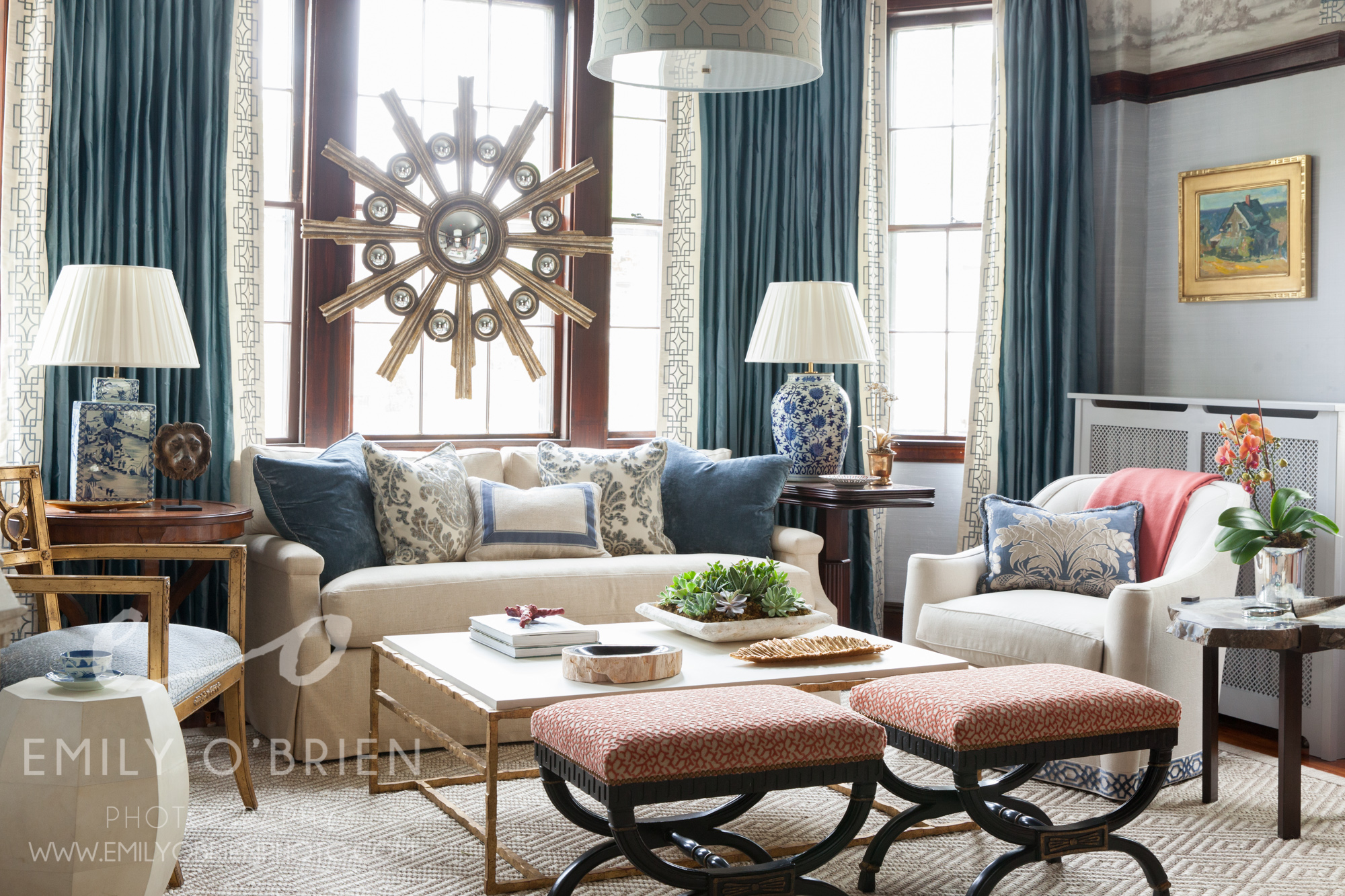
I am not an interior designer, nor would I ever think of putting an art piece smack in the middle of a window, but to my surprise, it works! If you look closely, you can see the spherical balls reflecting the entire room over and over. The cozy sitting area, perfect for daytime tea, or evening cocktails, is made all the more inviting by pillows and many textures. Can’t you just imagine a modern Chinese tea party here?
And look, it leads you right into the kitchen! (kitchen photo here)
Don’t forget to check back with Kim's blog from yesterday for a glimpse upstairs, and Beth’s from last week if you missed it.
Have a phenomenal long weekend!!! xoxo
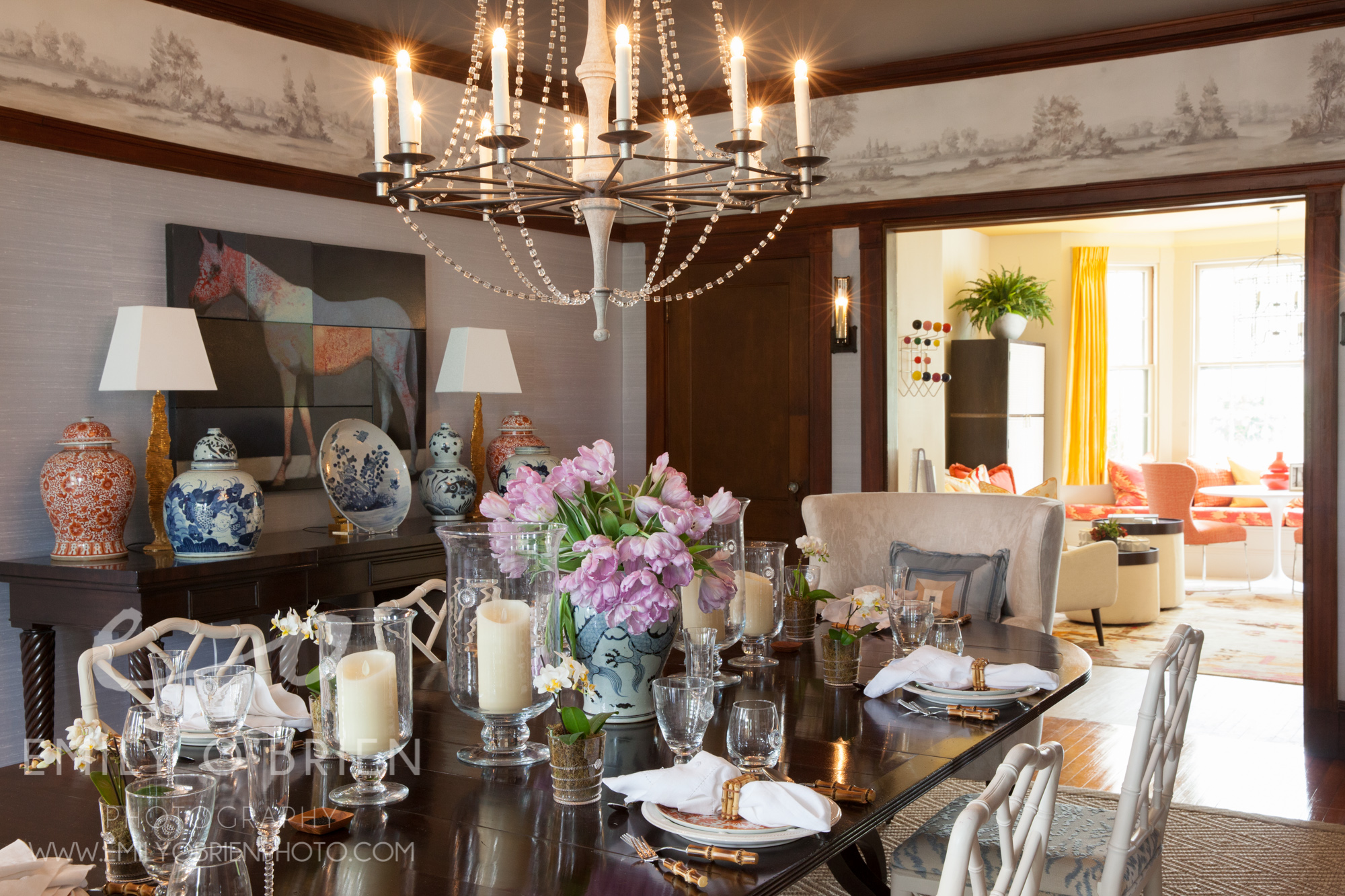
The Grand Dining Room was designed by Theo and Isabella, to see more of their work, check them out at theoandisabella.com
The Show House is going on through June 5th, and you can purchase tickets for $35 at www.BostonShowHouse.org

Boston Interior Photographer | Boston Decorator's Show House
Who doesn’t love a beautifully designed room? When I heard that the 2016 Junior League of Boston Show House was using the historic Nathanial Allen House and allowing the top interior designers of Boston to create 24 uniquely stunning rooms, I couldn’t wait to visit. My friend Beth Daigle, editor of Merrimack Valley Magazine, and blogger for 3olivesandatwist came along to co-blog about the experience… and what an experience it was walking through this incredibly restored 19th century Greek revival home.
Three months. These interior designers transformed these spaces in three months. Floors, walls, window treatments, furniture, lighting, and even plumbing in some. Each room was so well thought out and different, yet the whole house seemed to have a cohesive flow as you are walking through each room.

The first two rooms we set foot in, The Receiving Room and The Sitting Room, designed by Gerald Pomeroy Interiors made me want to invite guests over for tea and a garden party. The center table with its massive spring floral arrangement to offset the equally grand decorative plate behind it was the first wow factor. The silk turquoise wallpaper was the second, and the floor to ceiling windows made the room shine with brightness.
Gold accents everywhere made the room feel regal, and I have to say my favorite detail was the books covered in some sort of white linen paper. What a well thought out touch. The artwork, the colors, the styling, the Greek key detail on the floor, the details, everything came together so perfectly.

Head over to Beth's blog on Monday and interior designer Kim Macumber's blog on Tuesday to get their take on two more rooms.
The Show House is going on through June 5th, and you can purchase tickets for $35 at www.BostonShowHouse.org and you can watch their WCVB-TV 5 shout out here
For more info on Gerald Pomeroy go to www.gpomeroyinteriors.com
Boston Interior Photography | Les Fleurs Winter Wonderland Loft
I am a little late on this blog post, but better late than never! I think it is fitting for a pretty snow day anyway...
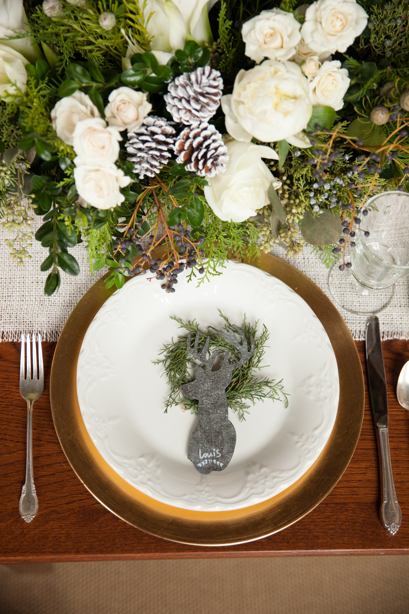
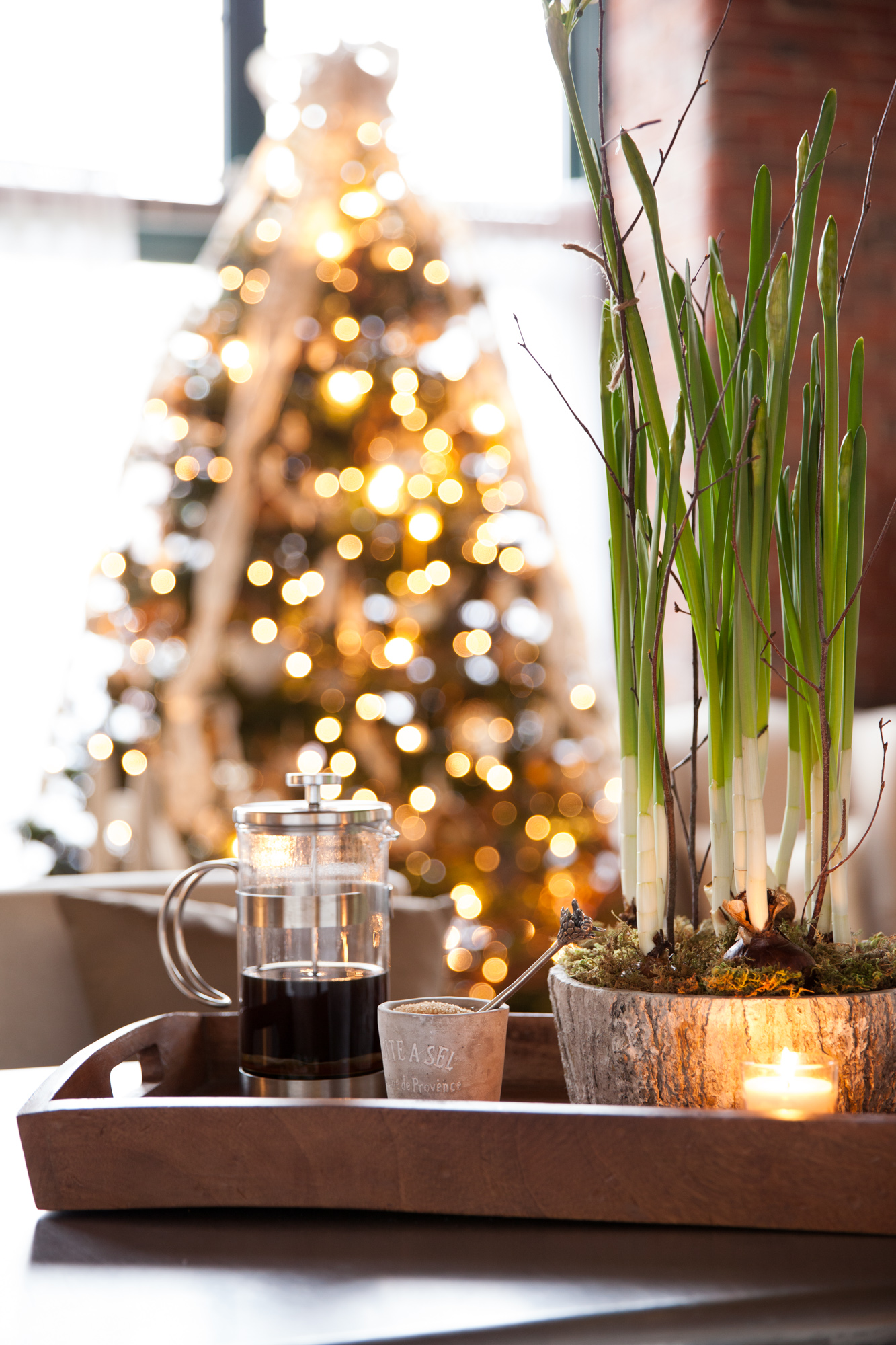
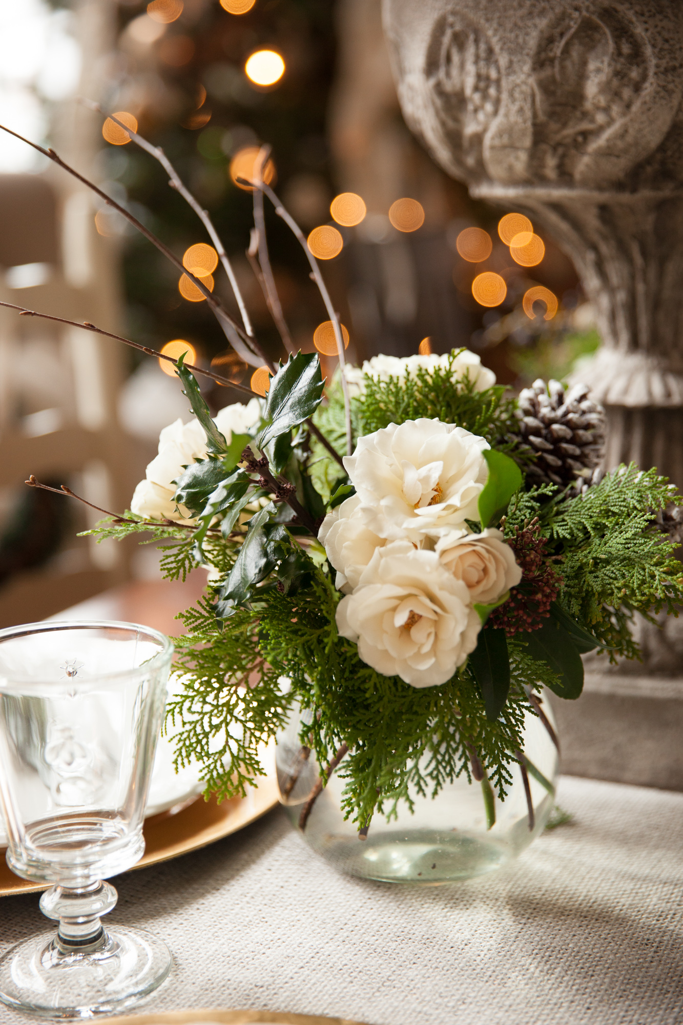
Merrimack Valley Home Magazine sent interior designer Linda Holt and I to this gorgeous Lawrence loft to photograph our Winter 2015 cover. The loft belonged to Les Fleurs' Event Director, Kerianne, and I literally gasped when we walked in. It was a winter wonderland… and not an in your face red and green Christmas overload… a beautiful wintery, editorial spread waiting to happen. It was everything I could have asked for in winter home décor.

She had greens and winter-whites with subtle flashes of gold and silver everywhere. Every last detail was considered, especially the small finishing touches that made it personal and inviting, such as the books on the table, and the reindeer name tags at every place setting.

Linda and I had a blast photographing the mill building converted into a loft, with the high ceilings and industrial windows (perfect window lighting). Kerianne’s details made it feel special and welcoming too, which is why I think the French press coffee setup that she put out made the cover.
The table setup was out of this world, and we really didn’t need to touch a thing to photograph it. I want these florals in my home all winter long!


You can see the full story in the Winter issue of Merrimack Valley Home Magazine, and you can find more information on Les Fleurs here.
Thanks for reading!
Questions or comments? Leave a comment below, or Contact me, I love emails
Merrimack Valley Home Magazine | French Decor and Les Fleurs
Our most recent photo shoot for Merrimack Valley Home Magazine featured the home of Sandra Sigman, owner of Les Fleurs in downtown Andover. I guess it’s to be expected that the greenery and flowers in her home would be outstanding, but the interior design work throughout her home was truly awe-worthy. Right on Lake Cochichewick in North Andover, her home feels like you are walking into an editorial spread, which of course is WHY we were shooting there for the spring issue.
Our focus was her Paris-inspired dining room when shooting there, but her whole home had beautiful rustic French accents. The big light colored chairs and delicate accessories were the perfect compliment to the rich wood and darker tones of the room. Read more about her home in Linda Holt’s article in the Merrimack Valley Home issue, on newsstands in the Merrimack Valley now.


Oh, and those incredible floral arrangements you see? Sandra's “flower shop”, Les Fleurs, isn’t your typical little florist. You walk into the store, and feel like you are walking into an Anthropologie catalogue. The first time I walked in, I immediately wanted to redecorate my home with earth tones, burlap, barn wood, and of course, interesting plants. They have a consultation room that I wish was my dining room (can I take that farm table home with me please??)
Les Fleurs specializes in creating floral arrangements for weddings, events, and homes. They always have the best seasonal arrangements and rare finds for the home and garden.
Boston Architectural Photographer | Kim Macumber Interior Designer (Part 2)
My second shoot with Kim (see our first shoot here), was an entryway that she had designed for a client in Hopkington, MA. The first word that comes to mind when describing this entryway is “Grand”. It was certainly a grand, elegant, striking entryway. VERY different from our first project together, the red room. The doorway was an enormous dark wood door that led into a foyer area that clearly needed a beautiful design to compliment the door itself. Kim designed a round table in the middle, decorated with green, beige, and silver accent pieces of all different heights to compliment the immense height of the entryway itself.


Alternate view of entryway from the dining room. Kim also designed the bathroom in the background
This simple, muted tones are very different from most of Kim's projects, but she did manage to throw in some beautiful pattern to the bathroom, which is so true to her style. This project makes it so clearly evident that Kim is so in tune with what each space needs and how to style it to allow the space to shine.
Merrimack Valley Home Issue | What Went Into Capturing the Beautiful Interiors, Plus 3 Bonus Photos
I love photographing beautiful interior design. “This issue may be the cover, so keep that in mind when shooting.” This was exciting to hear going into my second home photo shoot for Merrimack Valley Magazine. I was already thrilled to be working on this shoot with Beth Daigle and Linda Holt, so when I arrived and saw the interior of the home we had the privilege of photographing, I died a little inside [in a good way]. There was something very traditional about the decor, but simplified with use of color and modern elements.

Not many people know that Linda used to be a photographer, but it was a real treat to have her eye for design AND photography on this one. You may be thinking there is a chance that two photographers working behind one camera could be a competitive disaster… and in some instances I’m sure that would be the case. Linda and I were on the same page from the beginning and it was immediately a strong partnership working toward the same goal, noticing similar details, and playing off each other’s suggestions. It especially doesn’t hurt to have an extra set of eyes looking out for and understanding how the natural light will photograph.
We spent most of the day dancing around our “cover” shot because the light wasn’t just right, but when it was… ohhh it was.

I think we were also lucky that Sandy, the homeowner was such a gracious host to us. Now because Linda, Beth and I were on a tear, scrutinizing every detail, this meant lots of tweaking and furniture rearranging. Sandy’s furniture is beautiful… and heavy, very heavy. She didn’t mind us moving it around to get a good shot, so of course we decided to move the heaviest piece of furniture in the house {the solid wood coffee table}. Sandy’s husband came home toward the end, and being the gentleman that he is, moved the furniture back into place for us after… lucky us.
Here are some shots that didn't make the issue. If you haven't already, pick up a copy of the issue to read the full article by Alyson Aiello.

The white cabinetry against the dark wood gave an old country feel with an updated twist
Marble back splash to match the marble floor, against dark wood made quite an impact next to the pristine white whirlpool tub.
Color details add to the soothing environment

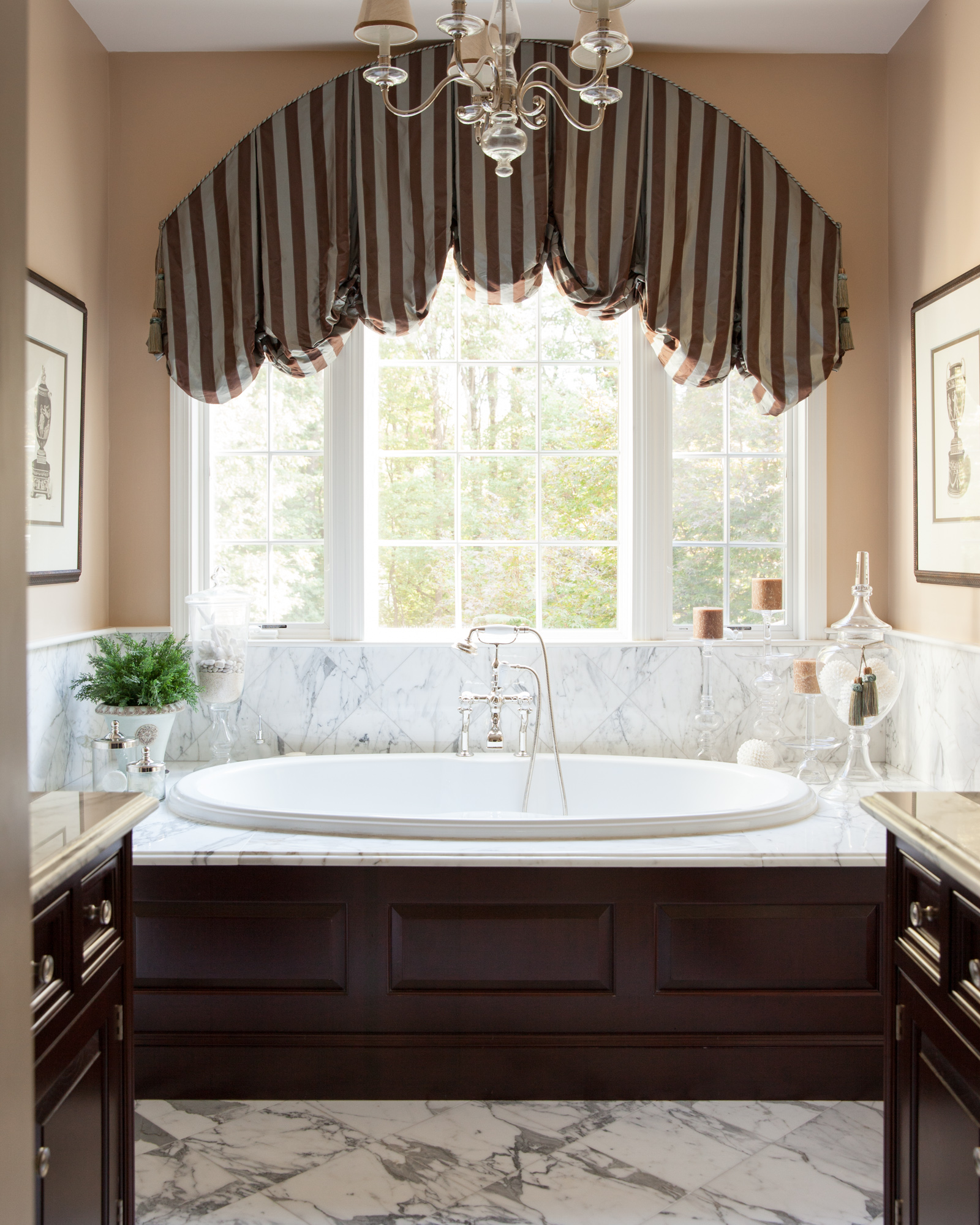
Boston Architectural Photography | Mary Michael O'Hare, Architect and Interior Designer for Beautiful Wenham Home
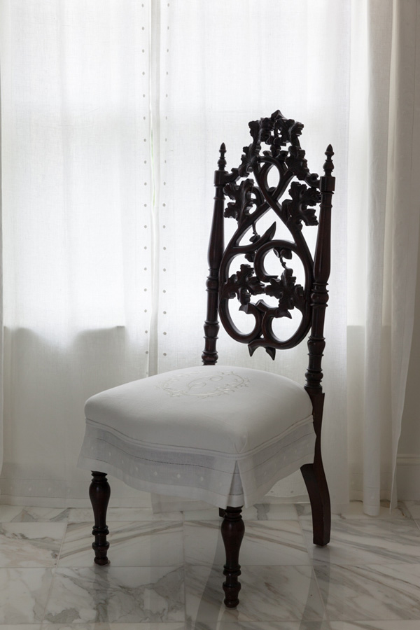
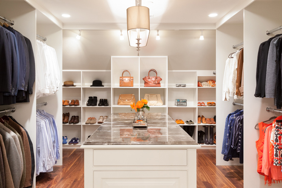
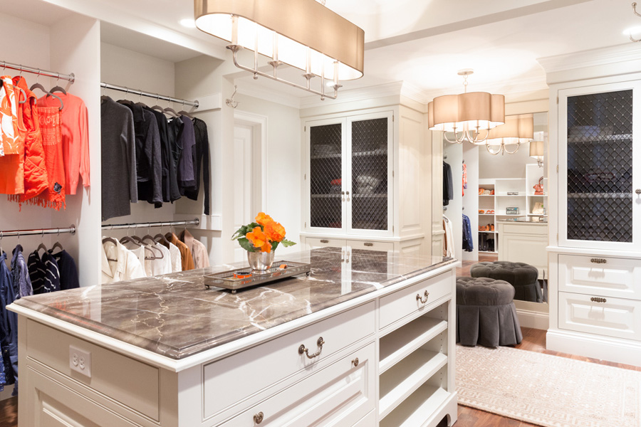
The first time I met Mary, we had a conversation about her being an architect and the “little” projects she worked on, like the one she was working on at the moment, “just a small bathroom and closet project”. Why all the quotation marks? Because after photographing this project with Mary, I realized how ridiculously humble she is. The bathroom is straight out of a design editorial, and the closet is bigger than most New York apartments… and beautiful, it’s all so beautiful.

Modern white bathroom with custom monogrammed chair
I knew it was going to be a good day when I walked in and was greeted by two beautiful Welsh Corgis and Betsy, the home owner, who me offered tea right away. Then I walked into the space and didn’t want to leave.
Betsy really got it right hiring an architect with such a keen sense of interior design. Mary created a luxurious feel, but also kept it structured enough to create a sense of ease that you may not normally feel in smaller spaces such as a bathroom or closet.
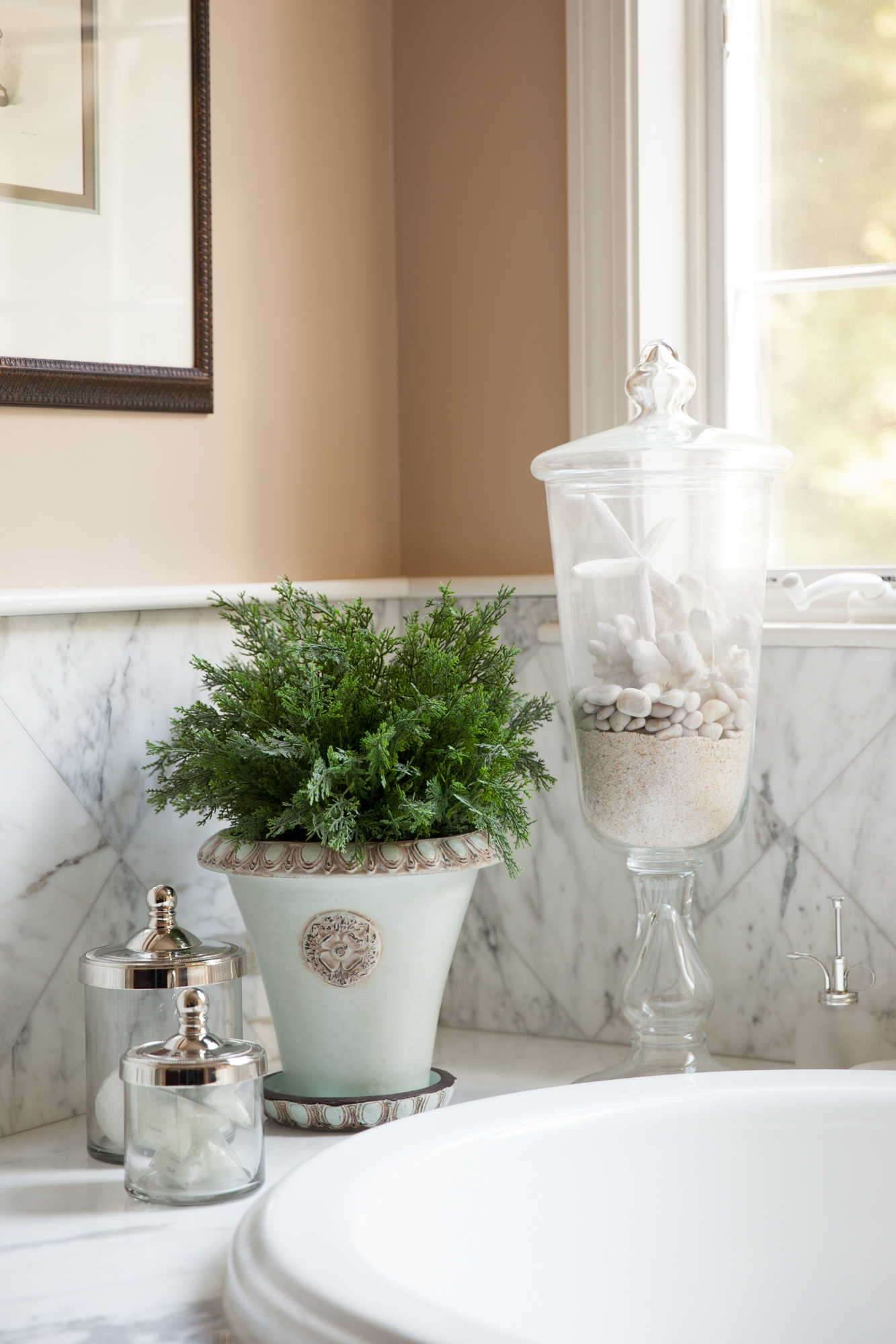
I think I love her work most because of her attention to detail. A woman after my own heart, she and I must have spent an hour just rearranging the knick-knacks on a shelf.

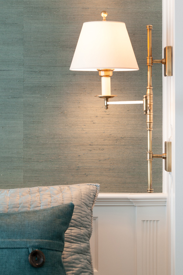
Master bedroom
The bedroom. Can we just talk about the color and texture of this bedroom for a second? I mean, I had to touch absolutely everything, but that color… if you weren’t calm after soaking in the glorious bathtub, you certainly are now that you walked into your bedroom.
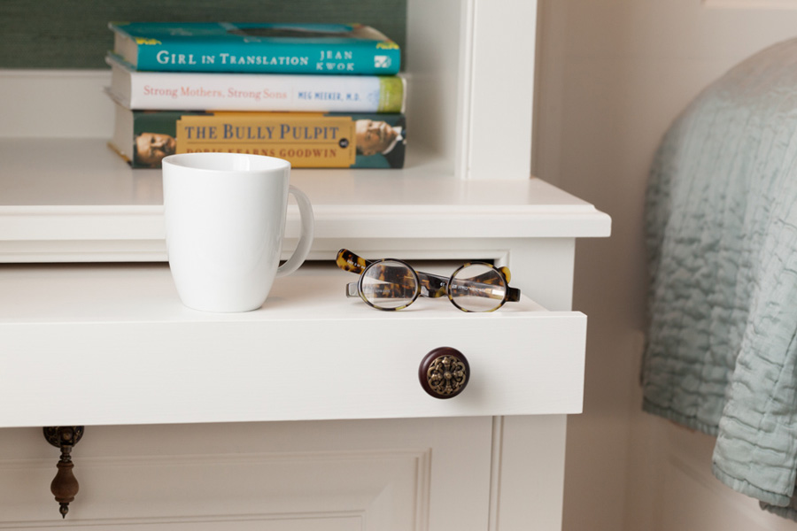
Pull-out nightstand tray
It was clear that the detail shots would be equally as important to this portfolio as the rooms themselves, like the intricate iron work on the closet door and the CHAIR. She found an old chair and personalized it by reupholstering with monogrammed fabric. This chair, with its intricate dark wood, really tied bathroom together.

See the before/after photos below. Mary really hit the nail on the head with this one.

CLOSET BEFORE PHOTO

CLOSET BEFORE PHOTO
CLOSET AFTER PHOTO
CLOSET AFTER PHOTO
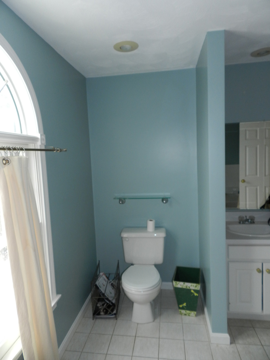
BATHROOM BEFORE
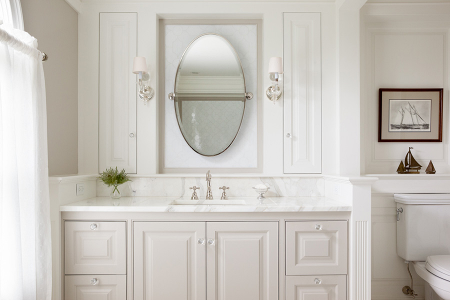
BATHROOM AFTER
While her website is in process, you can find Mary on Houzz
I always love to hear from you, leave a comment or contact me